Cozy mobile game wireframe
December 2018
The premise of this assignment was to start thinking about and visualize the UI of a game of our choice.
♠
The emphasis was to ensure an intuitive experience that was appealing and uncluttered despite the amount of information that it had to indicate without interfering with the game itself. My wireframe is for a cozy game based on making friends and doing favors for goodies in an elementary school setting. I find games that have positive notions like waking up early, being productive or organized, make me want to emulate those actions in real life so the following UI is for a game with those values. I also wanted to make sure the tone of the game was conveyed in the appearance of the HUD.
Main view + Notification center
When playing the game the UI elements should be undisruptive. Information that needs to be conveyed most often does not require the player to open a menu.
The menus on the side are a phone, a note pad, and a closet.
IMAGE A: When a song changes in the game, a small set of musical notes appear by the phone icon, indicating where you can go to change or save the song.
IMAGE B: Player notifications or in the case of this game, text messages from friends (game requests), come out of the phone icon as well. The phone icon will pop out from the side and shake twice to replicate the vibration of a regular phone. The text messages ballon appears towards the top of the screen in order to not disrupt whatever the player was doing beforehand. Important information such as what the request needs for its completion is color coded according to what category it belongs to. This way the player is able to glance at the message and decide wether they want to address it or not.
IMAGE C: Once the story based message has been displayed, a small banner with the mechanical information of the game drops down. It contains information such as how many points one would get for completing the request, and wether you might get an item in reward because of it.
further interactions
If the players would like to access a menu, they may press on the icons on the side. While the other two icons only lead to a single place, the phone icon is a directory, and will reveal 3 smaller icons through a cloning motion. These icons are music, game information, and settings. They are stored in this subsection because the player will not have to interact with these screens enough to warrant them an entire section that would take up the limited space of a phone screen. Because of the simplicity of the icon layout, its position can be adjusted for left handed people or even positioned on top.
IMAGE A + B + C : This showcases the parent-child relationships of the 3 smaller icons with the phone icon, as well as how they are cloned. All aspects of a game should reflect its style, so the sub-icons are poured out of the main one, and then aligned beside the main icon as seen in IMAGES B + C. This whimsical interaction will add to the theme of young children at school. The player can either press on the phone icon and then press on the sub-icons, or press on the phone icon and slide in the direction of the sub-icon they wish to access.
MUISC SCREENS
When playing relaxing or low consequence games, I personally find the music in the game help bring to life the feeling of the world. My favorite part of Animal Crossing: Happy Home Designer was getting more records that I could put in people’s houses, so that I could try to match the mood of the character and their home to a CD. That is why I chose to have the music interaction screen be one of the explorations in the project.
IMAGE A + B: As seen before, the music icon is a sub-section of the phone icon. Once clicked, the other two sub-icons are reabsorbed into the parent icon, while the music one expands to cover the previous screen in a masking motion.
IMAGE C: In this screen you can see the song you are listening to, as well as interact with it (scrub, pause/play, and download to phone). Below these basic actions are three organizational tools. Since all of the available songs are displayed in a scrollable carrousel at the top of the screen, locked, unlocked, and favorites, is a way to find your way around the number of albums. You can favorite a song by simply clicking the heart icon on the right side of a record, which will remain hollow until pressed.
IMAGE D: Scrolling through your available records does not change the the song. In order to do that you have to click on the record of your choice. The background visualization of the screen will remain matching the song that is currently playing while scrolling. The player can quickly get back to the CD cover of the song they were on by being pressing on the visualization of the song they are listening to in the background.
IMAGE E + F: I wanted the action of changing song to also change the visual mood of the screen to mirror the effect that the mood of a song can have on a person. Because of this, when a new song is clicked, the record pulses out, and creates a ripple effect on the screen with the visual that matches the CD. I wanted it make this interaction feel meaningful and enjoyable, since music in games has those effects on me.
Inspirations for these screens are Cytus II and Animal Crossing: Happy Home Designer
Clothes and items screen
Since the game is based on trading and doing favors in elementary school what you are able to give to your classmates and future friends depends on what you bring with you to school. That is why the clothing aspect receives its own icon and page, as the player will be spending time in this screen.
IMAGE A: When the player clicks on the clothing icon, as with the phone icon, its sub-icons will clone themselves off of it to then position themselves accordingly.
IMAGE B: The tab the player is on will have inverse colors from the other tabs of its kind. Information that is relevant to gameplay will be displayed underneath the clothes or special knickknacks. This helps solidify the language of the game that will then make receiving notifications and quickly identifying what they require easier. Like with the music screen, the clothes are displayed in a scrollable carousel fashion.
IMAGE C + D: After the clothing sub-categories have aligned themselves, a hanger will come up from below, covering the main game screen as it does, and drag with it the rest of the clothing screen (containing the player character and their customizations.
the notebook icon
The Notebook screen is where the player goes to to find their classmates icons and information pertaining them and their requests (or texts). In this page there is also some flavor text, your friendship meeter, and clues as to how to unlock their next friendship gift to you. The aforementioned aspects fit into the screen as you open the notebook. Scrolling down will allow you to see a record of your interactions together which, since it is not directly relevant to gameplay, does not need to clutter the space with more pertinent information.
IMAGES A + B: With the note pad, instead of having the background be mostly covered but visible like at the top of the clothing screen, I wanted the note screen to emulate focusing on a paper while working. What you were doing previously is still there, but the notebook currently holds your most attention. Because of that the background, where the main game screen is, is faded.
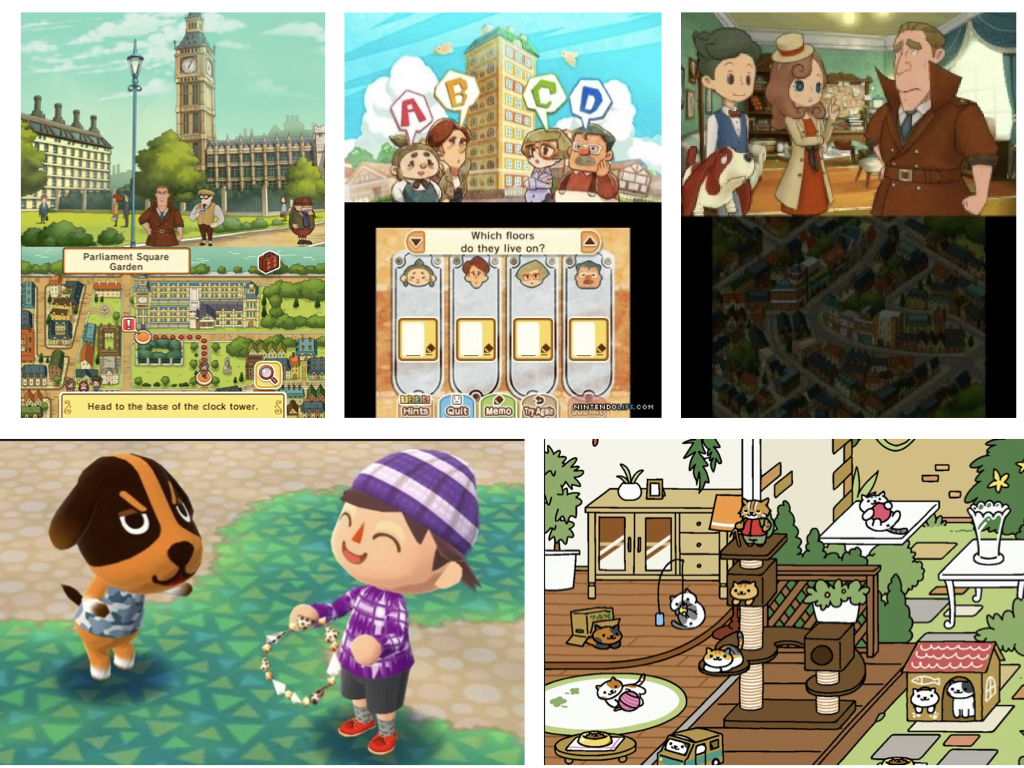
The main inspirations for the project. From left - right and up to down: Layton's Mystery Journey: Katrielle and the Millionaires' Conspiracy · Animal Crossing: New Leaf · Neko Atsume
♠♠♠